

What Is an Old Money Wedding? A Complete Guide to Timeless, Elegant Style
There’s a quiet kind of luxury making waves in the wedding world—less sparkle, more legacy. It’s called the Old Money Wedding aesthetic, and it’s redefining what it means to host a timeless, elegant wedding.
This style doesn’t shout. It whispers of generational estates, heirloom pearls, and handwritten love letters. It’s about restraint, refinement, and a polished sophistication that doesn’t try too hard—because it doesn’t need to.
If you’re dreaming of a wedding that feels enduring, classic, and chic in the most subtle of ways, this is the aesthetic for you. And as with all great things, the magic lies in the details—especially your wedding stationery and signage.
In this post, we’ll break down exactly what the Old Money Wedding aesthetic is, why your invitations and signage are more than just paper, and how to bring this look to life using timeless design elements and curated collections from Lily & Roe Co.
What Is an Old Money Wedding Aesthetic?
The Old Money Wedding aesthetic draws inspiration from a bygone era—think JFK and Jackie, Grace Kelly’s royal wedding, or archival pages of Town & Country. It’s classic American aristocracy meets understated European refinement.
It’s not about flashy logos or over-the-top extravagance. Instead, it’s about design that feels grounded in tradition:
-
Color palettes rooted in neutral tones like ivory, cream, forest green, navy, and gold
-
Typography that favors classic serif fonts and fine calligraphy
-
Textures like thick cotton paper, velvet, linen, or fine wax seals
-
Details that lean into heritage: crests, monograms, family heirlooms, and timeless etiquette
An Old Money Wedding feels formal yet personal. Elegant but not trendy. It tells guests: this is a celebration of deep love and enduring values.

Why Stationery and Signage Matter for Old Money Weddings
While trends often prioritize over-the-top installations or bold colors, the Old Money aesthetic quietly elevates the traditional pillars of wedding design—especially when it comes to paper goods.
Your wedding invitation is the first glimpse your guests will have of the celebration to come. And with a formal, elegant style like this one, it’s doing a lot more than just giving out logistics.
It Sets the Tone
A well-crafted invitation signals the formality of your event. It tells guests how to dress, how to behave, and what kind of experience to anticipate. An Old Money Wedding isn’t casual—and your stationery should reflect that with intentional elegance.
It Builds Excitement
Yes, even understated design can feel exciting. When someone receives a thick letterpress invitation wrapped in vellum and sealed with wax, they know they’re about to witness something rare and beautiful.
It Anchors the Aesthetic
The Old Money look thrives on consistency. Your stationery and signage aren’t just functional—they’re visual anchors that keep the entire wedding cohesive from start to finish.
3 Must-Have Stationery & Signage Details for a Classic Wedding Look
While every wedding is unique, certain paper details can instantly communicate that timeless, refined energy you’re after. Here are three essentials for bringing the Old Money Wedding aesthetic to life—along with curated pieces from Lily & Roe Co.’s most classic collections.
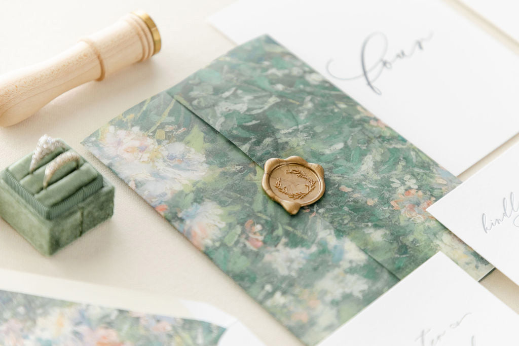
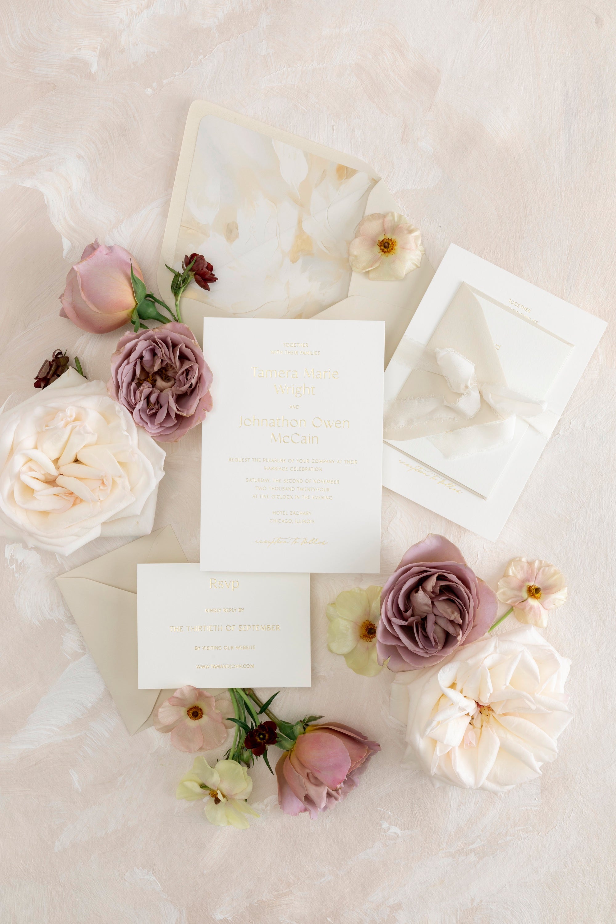
1. Letterpress Wedding Invitations with Elevated Finishes
Nothing says “old money” quite like a letterpress invitation. The tactile impression of the ink on lush cotton paper? That’s timeless luxury you can feel.
But don’t stop at the basics. To truly elevate your invitations, add details that exude refinement:
-
Vellum wraps lend an airy sophistication and a soft, dreamy texture
-
Wax seals add ceremony and visual weight, especially when personalized with your monogram
-
Ribbon ties or belly bands bring in formality and structure
We love combining these upgrades for a suite that’s as regal as it is restrained.

For timeless elegance with just the right amount of softness, explore The Amelia Collection—a favorite among couples who want romance without frills.

Looking for something light, delicate, and refined? The Lauren Collection is a masterclass in clean lines and graceful typography.
Both collections feature layout designs and finishes that make it easy to embody that generational wealth energy—without needing a royal budget.
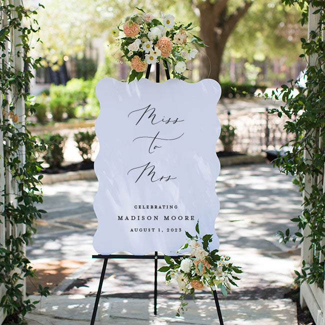
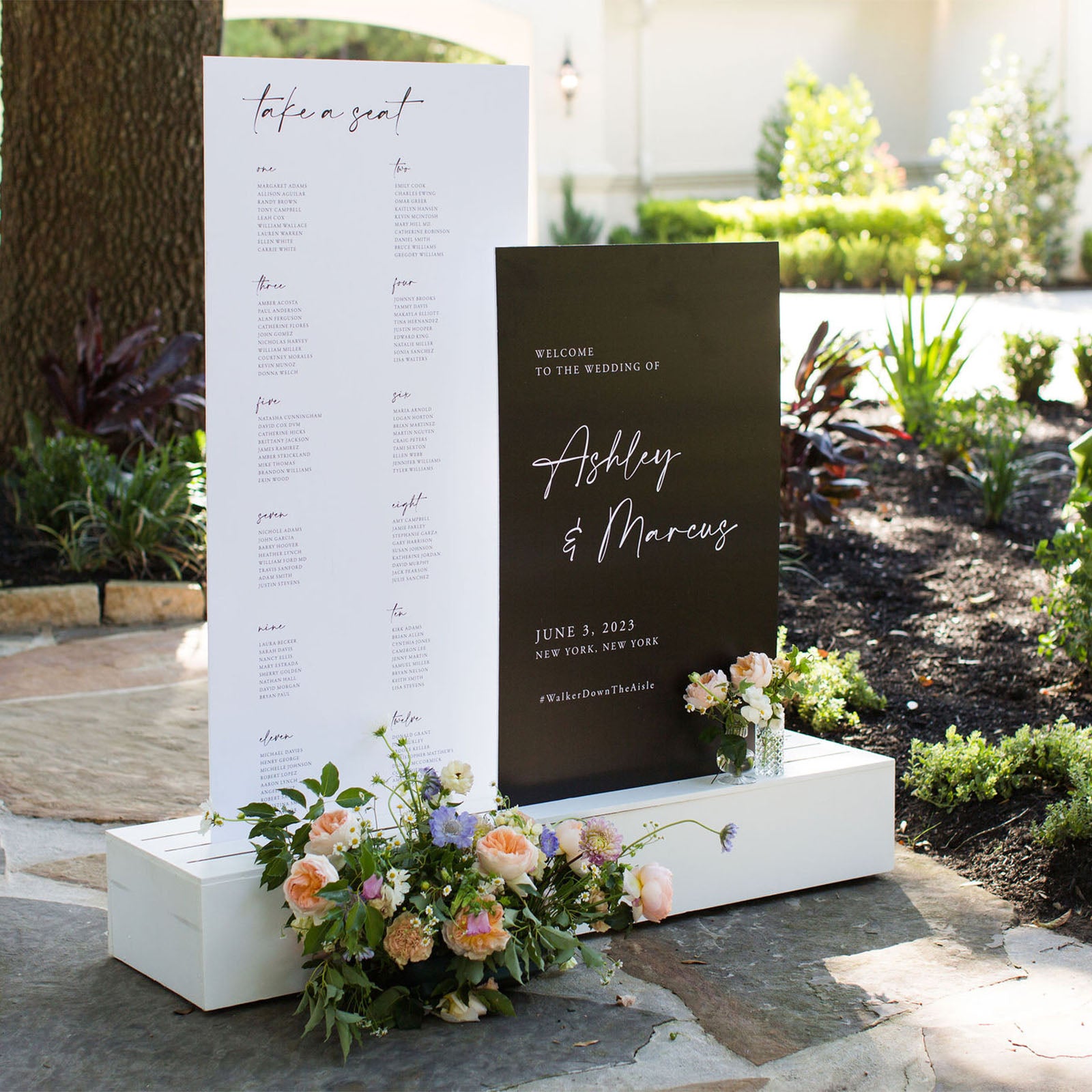
2. Large, Statement-Making Wedding Signs
Old Money Weddings avoid trendy signage tricks (like neon shapes with witty phrases) and opt instead for scale and presence.
Think:
-
Oversized welcome signs with minimal text and stately fonts
-
Tall, symmetrical seating charts that command attention without needing embellishment
-
Materials that exude luxury—acrylic or matte boards in neutral tones
The goal? Let your signage feel like part of the estate setting. Clean, bold, and grounded.

The Caitlyn Collection offers beautifully refined layouts for seating charts and welcome signage—minimal, elegant, and commanding in all the right ways.
Pro tip: Place your signs where they can truly shine—entryways, vestibules, or flanked by urns or florals (just don’t go too wild with arrangements; less is more).
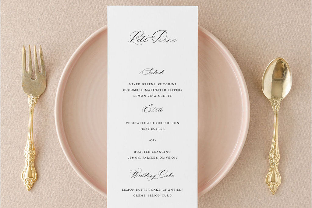
3. Printed Place Cards with Timeless Calligraphy Fonts
Personalized details don’t have to be handwritten to feel heirloom-worthy.
For a seamless look that’s polished and efficient, choose printed place cards that feature:
-
Calligraphy-inspired fonts
-
Classic serif typefaces
-
Neutral card stock in ivory, cream, or soft blush
You’ll maintain the refined style while ensuring your signage and paper goods feel consistent across every guest touchpoint.
While Lily & Roe Co. doesn’t offer handwritten options or textured vellum place cards, our printed place cards bring the same timeless impact thanks to carefully curated typography and layout.
Consider pairing these with a linen napkin or vintage place setting for a “my family has done this for centuries” kind of vibe.

How to Pull the Look Together
Creating an Old Money Wedding aesthetic means aligning every detail under a single design ethos: grace, not gimmicks.
Here’s how to tie everything together across your printed and displayed elements:
Choose Heritage Fonts
Stick with classic serif fonts or high-quality calligraphy. Skip playful or ultra-modern typography—they can clash with the sophistication you’re aiming for.
Stick to Traditional Layouts
Symmetry, white space, and proper etiquette matter here. Embrace hierarchy, use formal titles, and spell out numbers and dates where appropriate.
Limit Your Color Palette
Old Money color schemes rarely include more than 2–3 tones:
-
Base: ivory, cream, white
-
Accent: navy, hunter green, champagne, black
-
Metallics: gold or brushed bronze for subtle depth
Be Consistent
From invitation to menu, from welcome sign to place cards—consistency is the visual glue. The same font pairings, paper finishes, and color tones help create a seamless experience that looks—and feels—elevated.
Final Thoughts: It’s All in the Details
Old Money Weddings aren’t about extravagance for show. They’re about intentional elegance that whispers instead of shouts. And the beauty of this style is that it doesn’t age—what looked stunning in 1960 will still look stunning in 2060.
By choosing stationery and signage that reflects that timeless sensibility, you create a day that feels both deeply personal and beautifully classic.
And if you’re ready to start designing your dream suite or curating an elegant signage package, explore our full wedding collections. At Lily & Roe Co., we specialize in creating paper goods that stand the test of time—just like the love you’re celebrating.
✨ Still figuring out your aesthetic? Take our stationery style quiz to discover the perfect suite for your dream wedding look.

Stunning stationery designs for chic celebrations.
Shop The Collections
More Tips, Tricks & Expert Stationery Advice
Incorporating Metallics and Foil to Add a Touch of Glamour to Your Wedding Invitations
When it comes to creating memorable wedding stationery (the kind your guests will talk about for years to come), it’s all about the details—and nothing says “elegance” quite like incorporating met...
Read more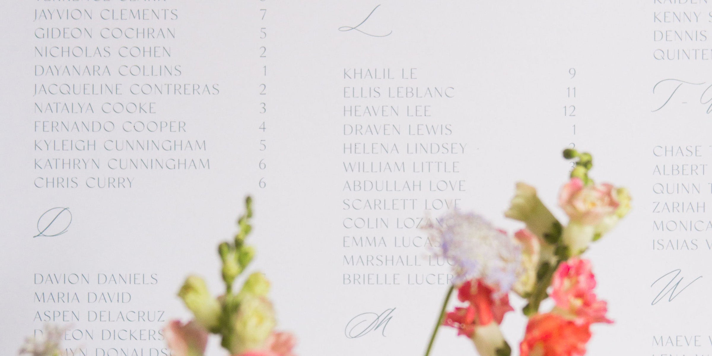
The Ultimate Wedding Seating Chart Guide
In this ultimate guide, we’ll break down exactly what a wedding seating chart is, why it matters more than you might think, and how to create one with less stress and more style. Whether you're jus...
Read more