

What Makes Wedding Invitations Feel Truly Elevated
Wedding invitations are more than paper. They’re the first chapter in the visual story of your wedding day. They give your guests a tactile sense of the tone you’re setting, the atmosphere you’re crafting, and the intention behind every detail.
In a world full of pretty templates and quick print options, what makes some invitations feel unforgettable, and others feel just “okay”?
Spoiler: it’s not luck, or budget, or even how many embellishments you can layer on. It’s design intention. And in this post, we’re breaking down exactly what makes wedding invitations feel truly elevated - so you can choose a suite that reflects your celebration with the same level of care you’re putting into the rest of your day.
Elevation Is in the Details
Whether your wedding is romantic and garden-inspired or modern and editorial, your paper goods should match the mood. But many couples who choose pre-designed or “semi-custom” suites walk away feeling like something was missing—like the invitation didn’t quite live up to the magic of the event itself.
That’s where design-level detail makes all the difference.
Below, we’re diving into the design elements that bring elegance, personality, and polish to a wedding invitation. These are the things that make a suite feel intentional, yes, even when it’s not fully custom.
And if you’ve ever looked at an invitation suite and thought, “Wow, that just feels like a whole moment”, this is what’s going on behind the scenes.

1. Paper Weight & Texture Set the Tone
Before anyone reads a single word, your paper sends a message. The feel of the paper—the weight, the texture, the finish—is the first tactile cue your guests get about your event.
A heavy, double-thick cardstock says “refined.” A soft cotton paper says “organic and romantic.” A linen-textured stock adds elegance. By contrast, a thin, glossy card can feel more like a flyer than an invitation.
Why it matters: Paper that feels substantial in the hand signals that this day is important and that you’ve paid attention to the details. It adds gravitas, even to minimalist designs.
Pro tip: Paper is one of the most underestimated design decisions you’ll make, but it’s also one of the most powerful.

2. Print Methods That Add Dimension
Not all printing is created equal. The way your design is applied to the paper can dramatically affect how it looks and feels.
Let’s break down a few popular options:
-
Digital printing is flat and smooth - great for full-color designs and budget-friendly options
-
Letterpress creates a beautiful debossed impression in the paper, adding texture and luxury
-
Foil stamping adds shine and elegance, especially in metallics like gold or copper
-
Embossing raises the design above the surface for tactile interest
-
Thermography offers a raised ink effect, often used for formal invitations
Why it matters: These methods aren’t just about looks. They literally add dimension to your invitation. They invite interaction and elevate the entire experience.
And for weddings with a more formal or luxurious tone, print methods like letterpress and foil can transform a simple design into something unforgettable.

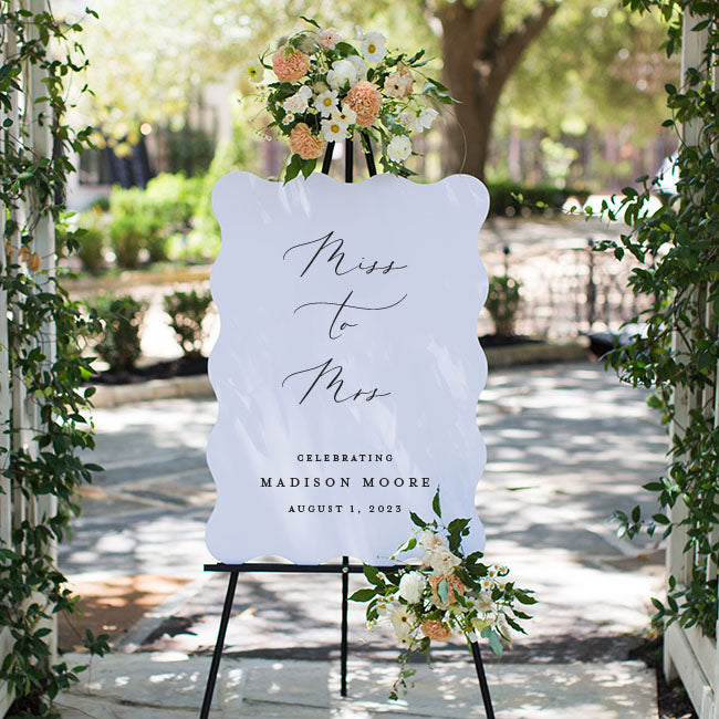
3. Scale & Shape = Subtle Sophistication
The shape and size of your invitation do more than fit into an envelope. They influence how the piece is experienced.
In 2026, we’re seeing a move away from the standard A7 rectangle and toward more distinctive choices:
-
Larger formats like A9 (5.5” x 8.5”) create a sense of presence
-
Die-cut shapes like arches, waves, scallops, and ticket edges add softness, personality, and movement
-
Mixed shapes across a suite create visual rhythm and hierarchy
Why it matters: Shape and scale subconsciously signal that this invitation is something special. They shift the pace of how it’s opened, read, and remembered.
An oversized, scalloped invitation printed on thick cotton paper? That’s a moment.

4. Typography with Intention
Typography is one of the most underappreciated aspects of invitation design, but it’s also one of the most powerful.
Fonts aren’t just decorative. They communicate tone. A serif font feels classic and refined. A modern sans-serif feels clean and minimal. A calligraphy script adds romance and movement.
But it’s not just about choosing a pretty font—it’s about how those fonts are used together:
-
Is there contrast between heading and body copy?
-
Is the layout balanced?
-
Is the hierarchy clear and easy to read?
-
Are the line weights and spacing thoughtfully applied?
Why it matters: Typography creates emotional tone. It controls the pace and visual rhythm of the invitation. And when done well, it adds elegance without needing any extra embellishment.
At Lily Roe Co., we believe typography is a foundational design element, not an afterthought. That’s why our new line, Luxe & Layered, includes intentional type styling across every suite.

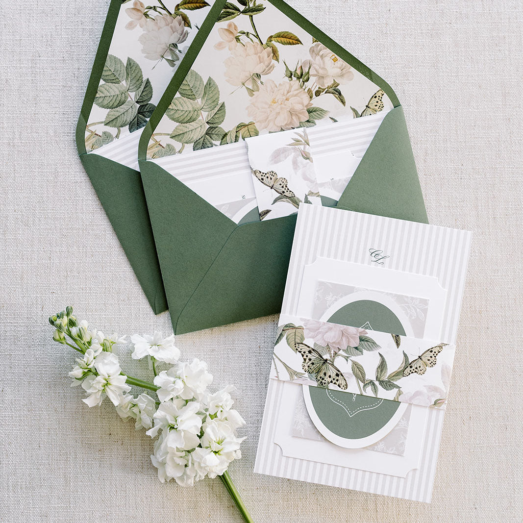
5. Thoughtful Color Palettes & Pattern Play
Color doesn’t have to be bold to feel elevated. In fact, the most luxurious invitation suites often feature a curated, layered palette that reflects the couple’s tone.
For 2026, we’re seeing an evolution from soft blushes into richer, more grounded tones:
-
Sage green and icy blue are still going strong
-
Plum, terracotta, chocolate, burnt orange, and lime green are emerging favorites
-
Neutrals remain timeless, especially when paired with strong typography and texture
But here’s where things get really interesting: pattern.
A well-placed pattern can take a color palette from “pretty” to powerful. Think:
-
Subtle florals on an envelope liner
-
Organic textures printed on vellum overlays
-
Soft stripes, abstract brushstrokes, or romantic motifs layered under text
Why it matters: Pattern adds movement, interest, and depth. It brings color palettes to life without overpowering the design—and it makes the suite feel curated and complete.
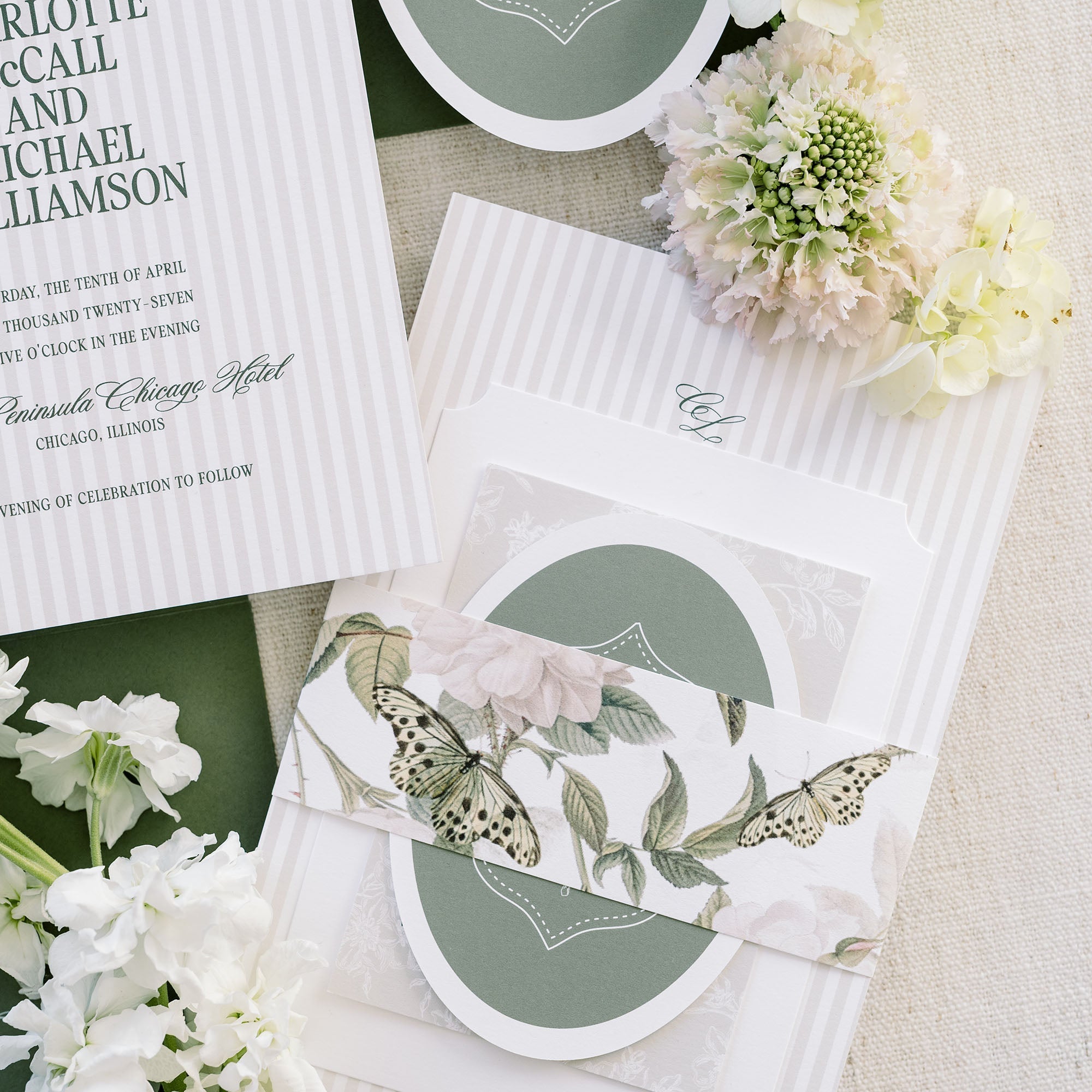
6. Layering That Invites Interaction
When done well, layering slows the guest experience down and turns opening the invitation into a small ceremony.
This might include:
-
Vellum wraps to soften and protect the suite
-
Silk or satin ribbon to tie the pieces together (literally)
-
Wax seals that feel timeless and tactile
-
Belly bands that organize and frame the contents
-
Envelope liners that add a surprise moment of color or pattern
The key? Intentionality. Choose 1–2 accents that enhance your design, not clutter it.
Why it matters: Layering creates physical engagement and adds meaning. Your guests feel like they’re being invited into something special—and they are.

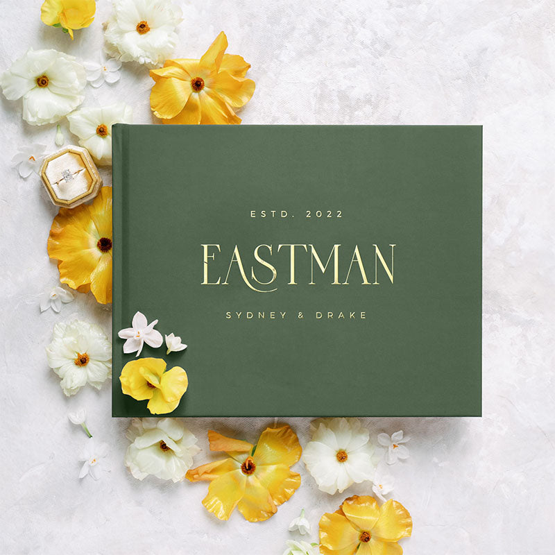
7. A Suite That Feels Like a Story
Finally, what makes a suite truly elevated is cohesion.
From your save the dates to your menus and thank-you notes, each piece should feel like it belongs to the same story. This is where true luxury shines, not in how much is included, but in how connected everything feels.
-
Consistent fonts, colors, and layout across all pieces
-
A design system that adapts beautifully from invite to place card
-
Visual language that supports your venue, florals, attire, and vibe
Why it matters: A cohesive suite feels intentional, not pieced together from different vendors or last-minute Etsy finds. It enhances the guest experience and helps tell your story through design.
This level of connection is often what distinguishes “nice invitations” from an unforgettable suite.
Design Detail Is the Difference Between Pretty and Powerful
The best invitation suites don’t just show your wedding date—they show your attention to detail, your style, and your story.
They say:
“This is how we’re celebrating.”
“This is how it’s going to feel.”
“This is a day that matters.”
Elevated design doesn’t mean ornate or complicated, it means curated. Every font, color, texture, and finish is chosen with care. And that level of thoughtfulness is what leaves a lasting impression.

Ready-to-Order, Designed to Impress
At Lily Roe Co., we believe semi-custom doesn’t have to mean compromise. That’s why we’re launching, Luxe & Layered, a new line of elevated semi-custom wedding invitation suites—designed to give you the luxury look and layered details you love, without the overwhelm of going fully custom.
You’ll find:
-
Die-cut shapes and premium paper stocks
-
Letterpress, foil, and digital print options
-
Curated color palettes and matching patterns
-
Thoughtful layering with vellum, ribbon, and wax
-
Coordinated designs across invitations and day-of paper goods
These suites were created for couples who want their wedding paper to feel as meaningful and beautiful as everything else they’re planning.
Follow Along for First Access
✨ Be the first to preview our new semi-custom collection—launching February 2026.
An Invitation Collection for Couples Who Crave Deluxe Design
Introducing: Luxe & Layered
Be the first to preview our new semi-custom collection—launching February 2026.